One Thumb, Twenty Apps: What Britain's Best and Worst Ask of a Crowded Bus
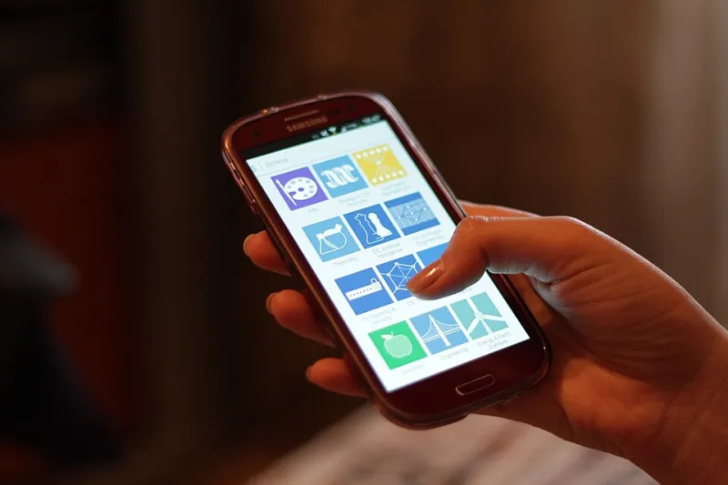
Photo: Océanos y dados, CC0, via Wikimedia Commons
On 10 November 2026, after a fortnight of testing, I found myself standing on a packed bus with a coffee in one hand and a phone in the other. The bus lurched. My thumb stabbed at a checkout button near the top of the screen, missed, and hit something labelled Cancel. That is the moment this audit became personal.
We tested twenty everyday UK apps one-handed: banking, rail ticketing, parking, supermarket loyalty, delivery, council services, messaging, maps, coffee rewards and a couple of NHS and government-adjacent tools. Not in a lab. In shop queues, on the top deck of a bus, outside a train station in the rain, and while carrying a takeaway cup that was definitely too full. The question was simple: how far does your thumb have to travel to do the thing you opened the app for?
How we scored the stretch
We mapped a rough comfort zone on a normal-sized phone. The lower third is easy. The middle is fine if you are sitting down. The top corners are a stretch, and the top-right corner is where good intentions go to die. We gave each app a thumb-tax score out of 20, with penalties for key actions outside the lower half, close buttons in the far corner, forms that shove the keyboard over the button you need, and destructive controls sitting within a few millimetres of the one you actually meant to press.
We also counted near-drops. Not scientific near-drops, just the small gasps you make when the phone tilts and your little finger saves the day. And we counted accidental taps that changed something — a date, a seat, a delivery slot, a payment card. Those are the ones that cost you time, not just patience.
The repeat offenders
The worst pattern is not a single button. It is a journey. A rail app asks you to search from the top, choose from a list in the middle, then confirm at the bottom, then close a modal at the top right. By the time you have bought a ticket one-handed on a moving bus, you have effectively done a small workout. The app has not been rude. It has simply been designed for a desk.
Parking apps are their own genre of thumb tax. The useful stuff — the session timer, the extend button, the receipt — often sits above a map that takes up most of the screen. The close control hides in a corner. In a shop queue, that is annoying. At the side of a road with traffic passing, it is worse. One parking app in our sample put the main action in a sensible sticky bar at the bottom. It felt almost revolutionary. It was just a button in the right place.
Supermarket and coffee loyalty apps were mixed. Several put the loyalty card or QR code behind a top tab or a menu. If the whole point is to show a barcode at a till, that barcode should be one thumb-press away, not an expedition. The better ones opened straight to the card or kept it in a bottom tab. The worse ones opened to a personalised feed about seasonal offers while a queue formed behind me.
Banking apps were generally better, but not uniformly. The big high-street apps have learned that bottom navigation works. A few challenger apps still tuck transfer confirmations near the top, and one made me scroll past a promotional card to reach the button I needed. Promotions are not the task. They should not stand between a thumb and a payment.
Council and government-style apps were the wildcard. One council app had a clean bin-collection screen but buried it two menus deep behind a top-left hamburger. Another asked me to type an address into a form that pushed the submit button under the keyboard. These are not glamorous apps, but they are exactly the ones people use in a hurry, often while standing outside in the cold. They deserve better than a layout that assumes two hands and a quiet desk.
The quiet winners
The best apps shared a few habits. They put the primary action in a sticky bar at the bottom. They used a bottom tab bar for the main sections. They made search reachable with one thumb. They kept destructive actions away from confirm buttons. They used bottom sheets instead of full-screen modals, so closing something did not require a climb to the top corner. And they remembered that a phone is held, not operated like a cash machine.
Maps and transport apps did well when they let you swipe rather than reach. Messaging apps were mostly fine because the keyboard does the heavy lifting and the send button sits where your thumb already is. The NHS app was calmer than I expected, though some sections still required a stretch. The lesson is not that every app must be redesigned around a lazy thumb. It is that the most common actions should be close to the hand that is already holding the device.
What the thumb tax actually costs
A badly placed button is not a dramatic failure. It is a small tax paid in awkward stretches, accidental taps and near-drops. It is the extra second in a queue. It is the moment you almost order the wrong delivery slot because the confirm button and the back button are neighbours. It is the receipt you cannot find because the close control is in the top corner and your thumb is busy holding a coffee.
In our sample, the difference between the best and worst apps was not features. It was placement. The least taxing apps scored around 4 out of 20. The most taxing crept into the high teens. That gap is enough to make one app feel calm and another feel like a minor obstacle course. Nobody opens a parking app for the joy of it. The least an app can do is not make the simple bit hard.
The fix is not exotic
No one needs a radical new design language. Move the main action to the bottom. Keep the close button within reach. Do not put a promotional card in front of a payment. Test the app with one hand on a bus, not just two hands on a desk. Try it with a phone case on. Try it on a smaller screen. Try it while carrying something. Britain does not use apps in ideal conditions. It uses them in the gaps between real life.
The apps that understand this do not feel clever. They feel obvious. That is the point. A good one-handed app does not ask you to admire its layout. It just lets you get on with the thing you were doing, thumb where it already is, coffee still upright.