Eyes Off: A VoiceOver and TalkBack Field Test of Twenty Everyday UK Apps
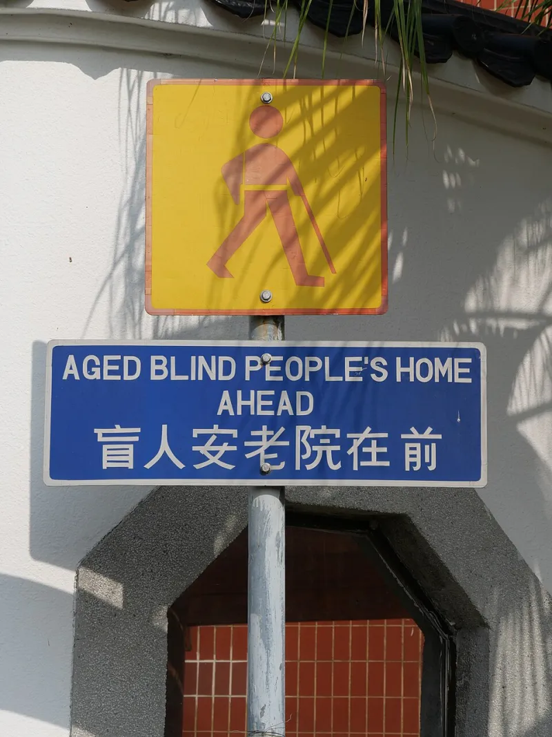
Photo: Peachyeung316, CC BY-SA 4.0, via Wikimedia Commons
Accessibility audits often read like compliance paperwork: a list of failures, a score, a polite request to do better. This is not that. This is a field test. We took twenty popular UK apps — banking, energy, rail, parcel tracking, retail, health and council services — and used them with the screen reader switched on. No sighted help except to reset the phone when we got stuck. The question was simple: can a blind or low-vision user complete the ordinary task the app was built for?
How we ran the audit
We used an iPhone SE with VoiceOver and a Pixel with TalkBack, both running current software as of November 2026. For each app we tried two tasks: one everyday job, such as checking a balance or paying a bill, and one slightly awkward job, such as booking a train with a Railcard or tracking a parcel that had gone missing. We noted four things: whether controls had meaningful labels, whether focus moved in a sensible order, whether colour contrast held up for low vision, and whether the task could be finished without sighted intervention.
We did not mark an app down for being plain. We marked it down for being unusable. Those are different things, and the difference matters.
The four failures we kept meeting
The first was the unlabelled icon. A button that says nothing, or says 'button', or says 'image'. One banking app had a row of five icons at the bottom of the screen. VoiceOver announced four of them as 'button'. The fifth was 'more'. That is not a navigation bar; it is a guessing game.
The second was the focus trap. You swipe right and the focus jumps to the top of the page. You swipe again and it goes back to the same place. On one energy app, the cookie banner kept taking focus even after it had been dismissed. On a rail app, the date picker trapped focus so completely that we had to close the app and start again. A screen reader user should be able to move through a form in a straight line. If the app fights back, most people give up.
The third was the custom control that does not announce its state. A toggle switch that never says 'on' or 'off'. A tab that never says 'selected'. A quantity stepper that says 'plus' and 'minus' but not 'two items in basket'. These are not exotic failures. They are the digital equivalent of a door handle that turns but does not open.
The fourth was the timeout. One council tax app logged us out after 90 seconds of inactivity while we were still reading the screen. Screen reader users often need longer, not because they are slow, but because listening takes time. A 90-second timeout is a design choice. It is the wrong one.
What it feels like when a button has no name
Imagine paying a bill and hearing 'button, button, button, button'. You know one of them is 'pay now'. You do not know which. You can swipe through every element on the page, but the app does not group the bill amount with the pay button, so you lose the thread. You can ask someone nearby, but that defeats the point of an app. You can ring the supplier, but the phone line closes at 5pm. So you close the app and hope the bill is not urgent.
That is not a niche inconvenience. The RNIB estimates that more than two million people in the UK live with sight loss. Many of them use smartphones every day. If a bill payment screen cannot be operated without sight, the app is excluding a paying customer. The same goes for train booking, parcel claims, prescription renewals and council services. Accessibility is not a charity feature. It is the difference between a service that works and one that does not.
The quiet winners
Seven of the twenty apps completed both tasks without sighted help. Five more completed them with workarounds, such as using the web version or asking a support agent to do it. Eight failed at least one core task. That is not a catastrophic score, but it is not good enough either.
The best apps had a few things in common. They labelled every control. They grouped related information into sensible chunks. They announced errors clearly, for example 'card number is incomplete' rather than 'error'. They kept focus in a logical order. And they did not rely on colour alone to show what was selected.
One banking app was quietly excellent. VoiceOver read the balance, the recent transactions and the pay button in a sensible order, and the payment confirmation was announced without us having to hunt for it. One rail app let us book a ticket with a Railcard in under four minutes, including the date picker. One parcel app announced tracking updates as they happened rather than making us refresh. None of these apps advertised their accessibility work on the home screen. They just did it.
Fixes worth demanding
Most of the failures we found are fixable in days, not months. Label every interactive control. Do not use 'button' as a label unless the button literally says 'button'. Group related content so a screen reader reads the bill amount and the pay button together. Announce state changes. Extend timeouts for screen reader users, or remove them where they are not needed for security. Test with real VoiceOver and TalkBack users before release, not just an automated checker.
And publish an accessibility statement that says what works and what does not. Not a badge. Not a promise. A plain-English note that tells people what to expect.
The bottom line
The UK apps that got accessibility right did not make a fuss about it. They just built the thing properly. The ones that failed did not fail because accessibility is hard. They failed because nobody checked. That is the part worth changing. A screen reader user should not have to ring the council because the app has an unnamed button. They should be able to pay the bill, book the train and track the parcel like everyone else.
If an app only works when you can see it, it does not really work.